September 2023
What is Cost Segregation?
Cost segregation is like breaking down a big building's cost into smaller pieces to see if some parts can help you save money on taxes. Cost Segregation Authority's analysts use this app to catalog and break down property assets to see how they can best assist their clients.

Think of it like this: Imagine you order a big pizza with lots of different toppings. Instead of paying for the entire pizza in one go, you can separate the cost of each topping. That way, you can decide how much you want to pay for the cheese, the pepperoni, the mushrooms, and so on.
My Role
UX Designer
Timeline
This feature was completed after about 1.5 months
Responsibilities
User Research, Interaction Design, Visual Design, Rapid Prototyping
Overview
Cost Segregation Authority’s analysts expressed a need for a mapping feature to be used during their site visits and tailor-made for their workflow.
As the sole designer for this feature, I led research, created designs and a prototype, presented it to our client and then created documentation for handoff to the developers.
The feature was met with excitement from Cost Segregation Authority’s management team as well as their analysts.
Gaining a Clear Picture of the Problem
While I was the sole designer for this feature, it was part of a larger redesign effort that was split between myself and another designer. We decided to conduct our discovery research for the project as a pair. After we had finished an initial research phase consisting of a heuristic assessment, an observational study, and a qualitative interview, we identified a list of problems that needed to be solved in our redesign.
We then divided the problems and created a timeline for the project. I was assigned the following problem:
During our research process, we learned that certain assets, like areas of concrete and grass, are more easily measured using gps imaging software. The analysts were using an external tool, and then entering the amounts by hand into a spreadsheet.
Problem
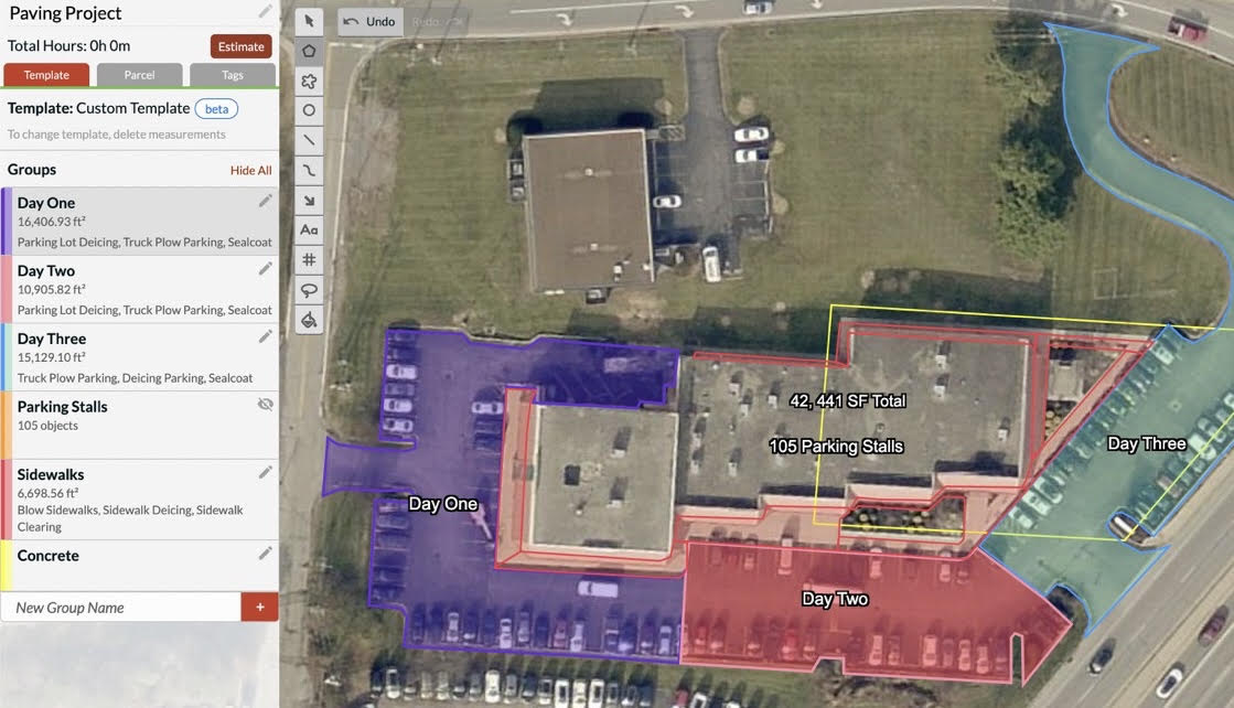
This is a screenshot of the measurement tool they were using
Competitive Analysis
To get an idea of how this new feature should function, I needed to understand what the analysts liked about the external tool that they were using, and what could be improved.
I reviewed screenshots of this product with some of the analysts and asked them how the tool was being used.
Outcomes
I made a list new features analysts needed in this new measuring tool:
Perimeter/Linear measurements
The ability to count property items by quantity.
The ability to exclude/subtract from a drawn area.
Technological Viability Interview
Once I had an idea of what kind of features were required for this feature, I set up an interview with our technology lead.
I needed to find out how these features should be built considering our project timeline, the amount of devs on the team, and other relevant factors.
Outcomes
Determined the drawing function should be vector based.
A "snapping" property would be added to avoid complications with overlapping measurements.
Determined users needed to be able to move, delete, or add individual vectors.
Designing My Solution
Weekly Design Reviews
Throughout the design phase, I met weekly with the Cost Segregation Authority Management team as well as 2-3 analysts to get feedback on my designs. This created a very tight feedback loop that kept the project on pace. When a change or correction to my proposed design were necessary, I was typically able to complete them within 24 hours of our meeting, thanks to the frequency of our meetings and the quality of feedback I was receiving.
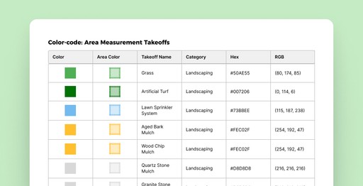
Creating the Color Code
Because the types of property items that are measured or counted are determined by a legal code that isn’t often updated, and because only those items found on the exterior of a given property can be counted using this mapping tool, I requested a list of all property items and decided to color-code them for easy recognition across projects.
At the same time I learned that Cost Segregation Authority had an existing color code for each property item, so I requested that information as well. I then divided the property items into 3 categories:

I created several spreadsheets detailing each property item and it's assigned color as well as, for the stamp measurements, its assigned icon. I created these for the developers to be able to reference during implementation.
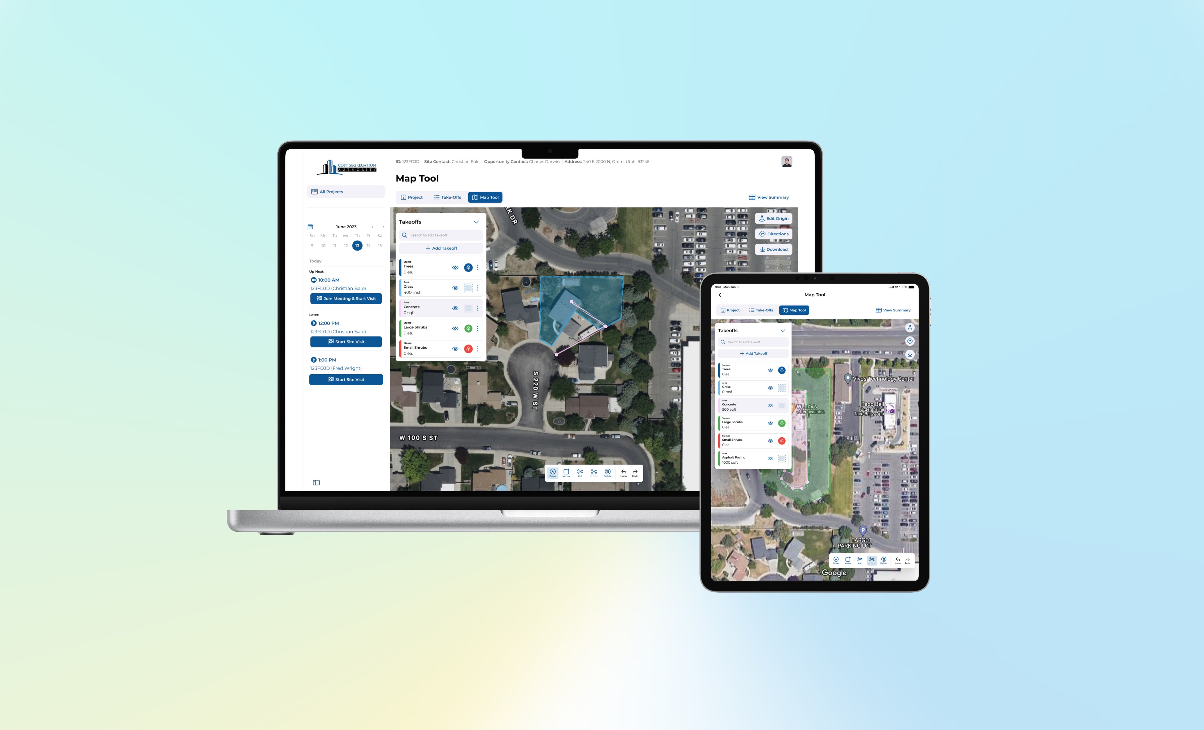
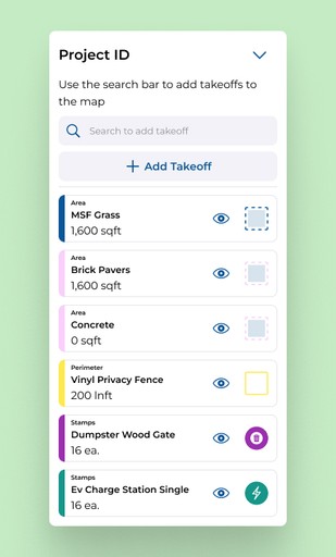
The Palette Side Menu
(note: Cost Segregation Authority refer to property items and features as “takeoffs”)
The user manages the property added to the map from the side menu. This UI structure was inspired by the external tool that the team was already using.
To add a property item the user may search for a property item in the search bar, or they may use the add takeoff button to pull of the add takeoff overlay. On iPad, Swiping left on one of the menu items reveals options for the user to delete or edit the selected takeoff.
When the user selects a takeoff, the existing objects on the map belonging to that takeoff is highlighted. At anytime the user is able to minimize the side menu by tapping the chevron in the top right corner. When the menu is minimized, the user state is maintained, any takeoff that is selected remains selected, the appropriate tools should still be available in the tool bar.
As takeoffs are added to the side menu, the side menu expands until it fills the usable screen space, once the maximum height is reached, the list becomes scrollable.
The Toolbar

The toolbar is always displayed in the bottom right of the screen for iPad and in the bottom center for desktop. However, each tool has individual requirements that need to be met for the tool to be enabled.
Draw Tool & Vertex Tools
In order for the draw or vertex tool to be available to the user, they need to have either a perimeter or area type takeoff selected.
Cut & Cut + Replace Tool
In order to have access to the cut or cut + replace tool, the user must have drawn at least one area shape on the map.
Delete
The delete tool should be available any time a take off or map item is selected.
Undo/Redo
Should allow the user to undo or redo there last performed action and continue to undo until reaching the end of all actions within that editing session.
Designs

Prototype
Once I had completed the UI design I went about prototyping the feature. I ended up splitting the prototype into several sections, one main prototype for the major feature in the mapping tool, and then one prototype for each function in the toolbox.
I presented this prototype to Cost Segregation Authority for approval, once the design was finalized and all stakeholders had approved, I created documentation for the developers in the Figma file as well as in our project Notion document.

Project Reflection
What went well
Our team worked efficiently and Cost Segregation Authority was one of the best clients I have ever had the pleasure of working with. Our initial research phase went well, it helped us to quickly determine the needs of our users.
Additionally, having frequent design review sessions sped the design process up. I did not waste time on unneeded features or solutions that would not meet the user's needs, thanks to the frequent feedback sessions.
What could have gone better
Testing. Though I did validate my design with users through our feedback sessions. Were I to do this project again, I would have campaigned for at least one day of onsite doing moderated testing on my prototype. I think providing the user with a task and very little explanation for how the map worked might have helped to find more potential problems with the design.